
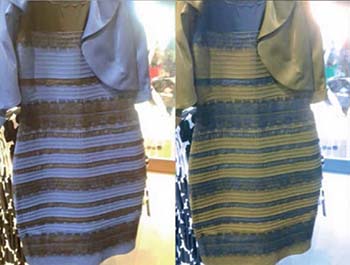
One study, by Michael Webster and colleagues, found that perceptions of the dress’s colors became much more uniform when the colors were flipped between the dress’s two dominant areas. After the flip, virtually all subjects saw the dress as yellow and blue. [Image: Winkler et al., Curr. Biol., doi: 10.1016/j.cub.2015.05.004]
For those who can’t get enough of #TheDress, the journal Current Biology has arranged your weekend reading: Not one, but three short papers examining different facets of individual color perception, and how they may have played out in the controversy over “the dress that melted the Internet.”
The Internet career of #TheDress started in late February 2015, with seemingly innocuous posts on Tumblr and Facebook of a dress whose actual color was in dispute—some saw the dress as white and gold, others as blue and black. Perhaps because the color perceptions seemed so divergent (and were often very strongly held), the story quickly went viral, gaining the ultimate greaser of the skids of Internet fame, a Twitter hashtag. (Actually, several hashtags—not just #TheDress, but #whiteandgold, #blueandblack, and, perhaps inevitably, #Dressgate .)
Scientists also attempted to explain what was going on—with mixed results. Now, three short studies in Current Biology have added data to the mix. And, while all three root the divergent views on #TheDress on details of human color perception and psychology, they focus on different aspects of the problem.
Internal models
In one study (Curr. Biol., doi: 10.1016/j.cub.2015.04.053), neuroscientists from Wellesley College and the Massachusetts Institute of Technology (MIT), USA, wondered whether the Internet’s #whiteandgold versus #blueandblack dichotomy had set up an “alternative forced choice.” They asked 1,401 participants in a free response-survey, including some people who had not previously seen the image, to report what colors they saw.
As expected, most of the respondents saw the dress as either blue and black or white and gold—but, surprisingly, a third group, amounting to more than 10 percent of the sample, reported seeing the dress as blue and brown. (Time for a new hashtag.) They also found that women and older subjects were more likely to see the dress as white and gold, while younger subjects and men favored blue and black. And perceptions of the dress color were highly unstable, and vulnerable to shifting based on differing cues regarding the probable illumination source of the photograph, the size of the photo, and other variables.
The team concluded that these results suggest that the differing results stem from differences in internal color “percepts”—the model constructed by the visual system and the brain to build a “best guess” model of the physical world from a flood of incoming sensory data. In particular, the brain’s views of whether artificial lighting or daylight illumination is the norm—which do, indeed, vary with age and gender—seemed to play out as expected in the team’s data.
Spokes on the wheel
In a second study (Curr. Biol., doi: 10.1016/j.cub.2015.04.043), scientists from Germany and the U.K. likewise found differences rooted in assumptions about the illumination source—but also considerably more of a continuum in color perception from white to blue. The scientists had 15 subjects view the dress on the same well calibrated, evenly illuminated display. Then they asked them to use a programmable color wheel to match the colors that they saw on the screen.
The team found that the subjects reported a range of shades for the areas corresponding to the lighter stripe on the dress, spanning light to dark blue, rather than the “white” or “blue” shades commonly reported. And they found that the subject choices of color on the dress tracked well with trends of natural illumination in daylight at different times of day. These data led the scientists to conclude, again, that the internal percepts built by individuals are the determining factor.
“It seems to be the covariation of luminance and colour that is required to elicit ambiguity about the dress,” the scientists concluded. “The popular image of this dress has shown impressively that our perception of the world is not just a result of physical properties recorded by our senses. Rather, we make assumptions about the world that guide the interpretation of sensory data, and these assumptions can be quite different for different individuals.”
It’s all about the blues
A third study (Curr. Biol., doi: 10.1016/j.cub.2015.05.004), from researchers in the U.S. and Germany, zoomed in on the particular ambiguity of blue, and the difficulty people experience distinguishing blue objects from blue illumination. The team began by asking 87 research participants to identify the color of the lighter stripe in the image; as expected, the responses divided roughly evenly between blue and white. But when the colors of the light and dark patches the dress were reversed, the result was striking: some 95 percent of the respondents reported seeing the dress as consisting of yellow and blue stripes.
The conclusion of the researchers: the differing views on the dress stemmed partly from “a novel property of color perception and constancy, involving how we experience shades of blue versus yellow . . . [S]urfaces are much more likely to be perceived as white or gray when their color is varied along bluish directions, compared to equivalent variations along yellowish (or reddish or greenish) directions.”