
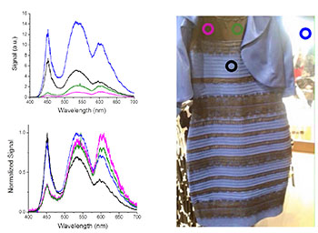
Four spectral samples are taken from an image of the dress. The top graph shows raw spectral data. The bottom graph shows data normalized to the images's white background.
Evelyn Strunk (evelynstrunk@knights.ucf.edu), a Ph.D. student at CREOL, The College of Optics and Photonics at the University of Central Florida (USA), wrote to us to offer a bit of spectral data on the Internet sensation #TheDress:
“The debate of #TheDress has gotten my attention as a Ph.D. optics student. Being at a lab with advanced equipment, I thought I could settle this argument through the medium of optics. At first, I saw the dress as white and gold, however, somehow my perspective changed and I now perceive the dress as blue and black.
“I used the screen of my iPhone 5c and the lab’s Ocean Optics High Resolution Spectrometer (HR4000). I took four spectra from the dress picture. The first spectrum was of the white background (blue circle); everyone, no matter how they saw the dress, agreed that this corner of the image was white. I then took two spectra in the top gold/black region of the dress; the spectrum on the left (pink circle) was in a shadow, so it was slightly darker than the spectrum on the right (green circle). Finally, I took the spectrum of the white/blue region of the dress (black circle). The spectra have corresponding colored lines in the graphs.
“I normalized the raw data to show the heights of the signals relative to the white background. In the top graph (raw data), you see that the blue curve, representing the shape of the white light in the corner of the picture, spans the visible spectrum: 400 nm to 700 nm. White light contains all wavelengths in that range.
“Next, I looked at the black curve in the top graph, from the white/blue region of the dress. There is a peak at 450 nm, which is, in fact, blue light. Blue light has a range from 450 nm to 495 nm. If you look at the normalized graph (bottom) for the black and blue curves, you see that they both have the same normalized signal in the blue range but the black curve is significantly lower than the blue curve in the higher wavelengths, showing that there is less white light and maybe more blue light in that region.
“In the gold/black region of the dress, the signals (pink and green curves) are significantly less than the white light signal (blue curve), which explains why some people would see this area of the dress as dark. If it were completely black, there would be no signal, so there is some trace of color here. In the normalized graph, the pink and green curves indicate a more orange color than the white background, which is perhaps why people are seeing this part of the dress as gold.
“Since I was able to see both the white and gold dress and the black and blue dress I am slightly disoriented, but at least now I know the spectrum.”